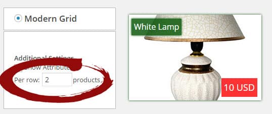
Todays update (2.2.0) for eCommerce Product Catalog focuses on modern grid design.
A new feature is available in product settings.

How it works?
The modern grid elements will always occupy the full width available. When you set 1 product per row it will most likely dispaly a very big element. Setting it to 3 will cause in three equal elements per row.
Additionally we implemented a script that handles the font size for very small product listing elements. If you set it to 5 (wchich is a maksimum supported value) than probably the elements will be very small. The script will lower the font size to fit everything inside the container.
Let me know in the comments how this new feature works on your configurations.
If there are any problems I will be happy to improve it. As always :)

Thanks for this update. It was like you were reading my mind :)
Glad to hear that! :)
Hi, I have a problem with the lates update. My product names are very little. How can I fix it?
Please update to 2.2.1 to fix this :)
Norbert, the design is really better now! Great Idea!
Thanks for the feedback!
Hello,
NIce. best should be so be able to set it as option of [show_categories] shortcode.
I made a “dirty” fix for a specific page
Hi Abonnefoy,
Thanks for great idea. It will be added soon!