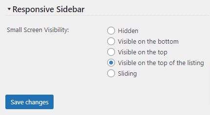
You can choose between 3 options to display the responsive sidebar:

- Hidden – the sidebar will not be visible on small screens
- Visible on the bottom – the sidebar will show up after the main content on small screens
- Visible on the top – the sidebar will show up before the main content on small screens
- Visible on the top of the listing – the sidebar will show up before the product listing and after the main content on the product page on small screens
- Sliding – the sidebar will show up as a clickable bubble on small screens; when clicked will slide in with the sidebar content.
Sliding Catalog Sidebar
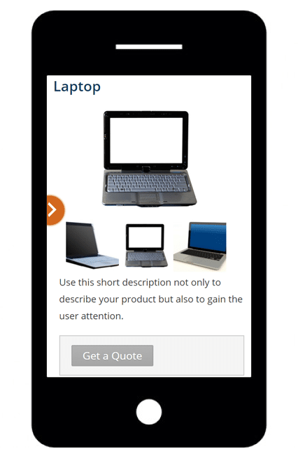
You can choose to hide the sidebar on small screens or show a small icon that will show the sidebar after being clicked/touched. It will show up on the right or left side of the screen (according to your sidebar position):

After the user clicks or touches the arrow icon, the sidebar will slide from the left or right side (according to the icon arrow).
