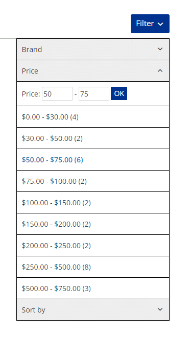
On small screens almost all filters are grouped under one button. Like this:

This makes the usability on devices with small screens better. What if you want to group the filters like this also for desktop screens? You can go to Catalog Settings > General and find the Filters Bar Widget Area section:

Check the filters always grouped checkbox. Now the filters button will be displayed on every device.
